
The last two months have been a blur of home renovation projects. While the previous owners had taken such wonderful care of their house, there were certain things we needed to do before we moved in. We ran cables, created extra electrical outlets… and we had almost every single room repainted.
And by "every single room" I mean "every single room". These are the rooms that did not get repainted: the first floor bathroom, three walls of the library/future playroom, the upstairs and master bathrooms, the master bedroom. We painted closets for crying out loud (well, just one, but still…).
We loved the house, but the colors really were not us. Not to mention the previous family let their children pick their room colors, leaving us with the Lemon-Lime Sprite Room and Room of Distinct Neon Yellow. So we (read: I) went over the colors time and time again. I agonized over "light mint" versus "frosted mint". We researched painters like mad and hired a team to do the first floor (as there was no way I was going to try painting the two-floor foyer). Our painters gave us a headache to end all headaches, but at least the end result is nice.
The foyer is the first thing your guests see when they come to your house. It can be inviting and entertaining…or it can be drab. The peanut butter walls were drab. My husband could not stomach the brown walls, and I hated how dark it made everything feel.
Even though our painters decided to paint this blue originally (I mean honestly, who does that? I'm shocked that no one was confused by such a color choice and looked back on the original paperwork to double-check), I love this cream color. It's open, it's light, it reflects natural light (and I'm all about natural light). When your foyer is two stories tall, any color is going to make a statement. And I like the statement this color makes.
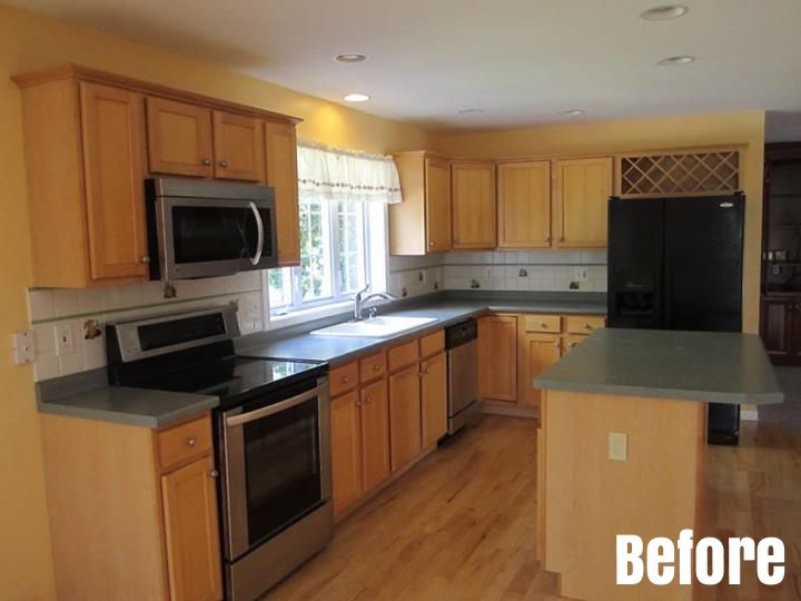
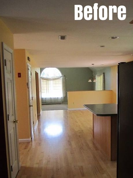
The light yellow walls made the kitchen feel old-fashioned. It accented all the wrong parts of the cabinets and counters and made everything feel like it had an orange tint to it. It didn't help that it was paired with a very nondescript green in the den, which I'll get to in a moment.
It really is crazy what a lighter shade can do. Going from yellow to cream opened up the room and made it more inviting. It complements the cabinets and counters nicely.
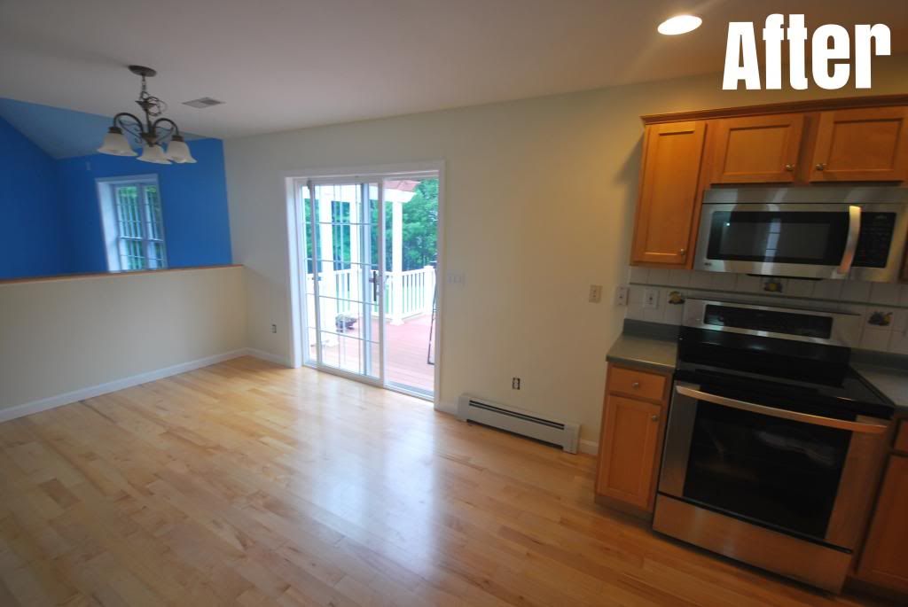
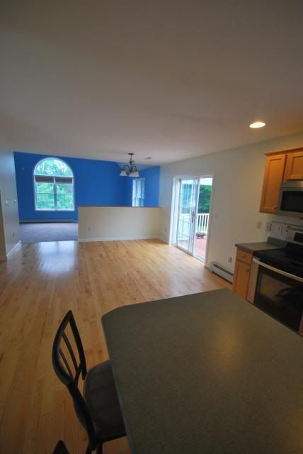
The original owners used the den the way most people use a living room or a parlor: no TV, no entertainment items, but a lot of antique furniture. It was clear that this was a room you went in with adult supervision only. And while we plan on doing that with our kids as well (if only because that is where our "nice" TV is, as well as our coffee table with sharp edges) this drab green has no place in a room you actually plan on using.
I took a chance and went with a bolder blue for the den. I picked something with a soft gray undertone so, when we watch movies at night, the walls could absorb more light. It goes perfect with the cream of the kitchen. Plus, this means that we have a blue room on one side of the house, and a red room on the other (and we already know how I am about blue/red sentimentality).
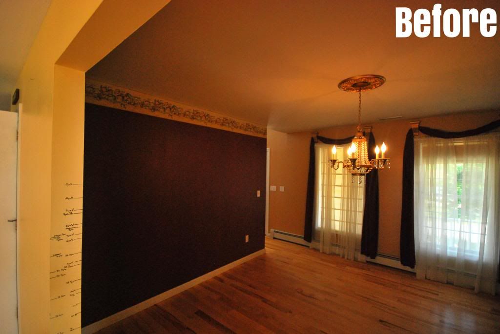

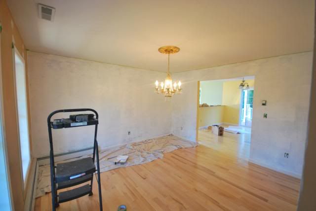
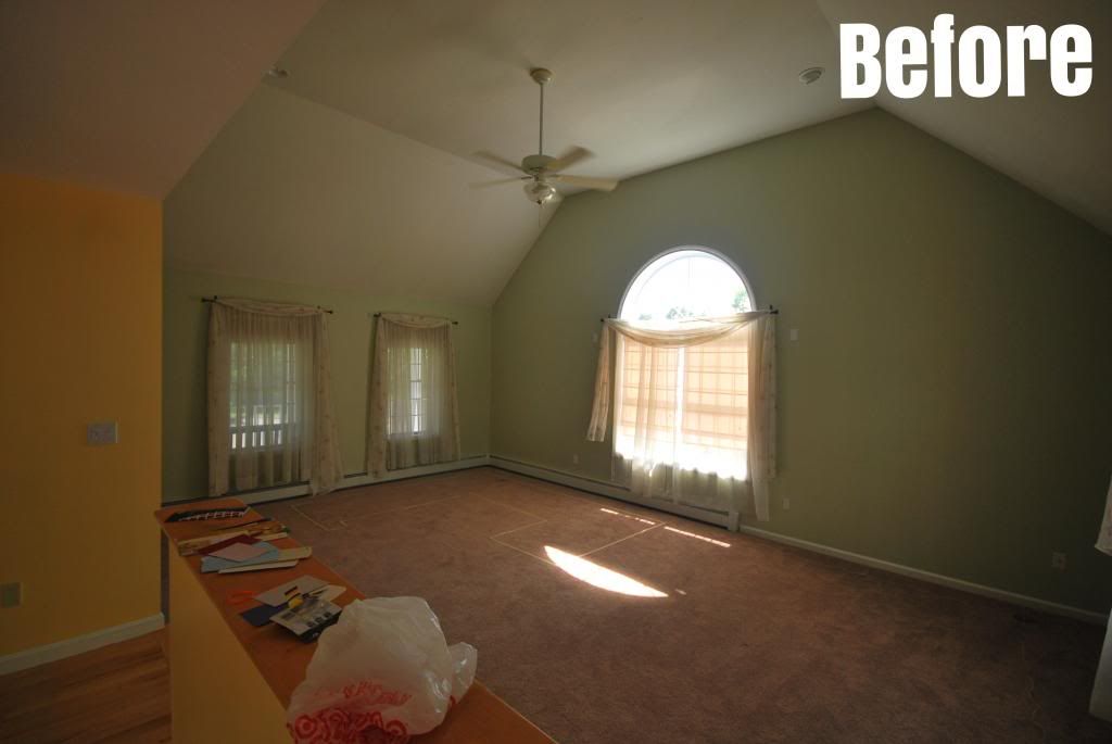
The dining room was originally the same color as the library/future playroom. And while I love that color in the library, I do not like it in the dining room. The dark colors made the room small and closed off. Not what you want if you are having Thanksgiving dinner. Not to mention that the wallpaper trim was gaudy.
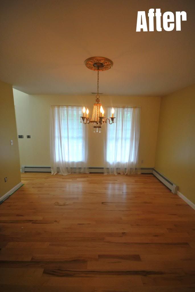
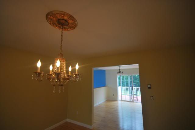
I already mentioned how we were able to get off all the wallpaper trim (and prime the entire room) ourselves. We then took the color pallet that we used with the foyer and went down a color or two. This tan/ginger color (paired with the richer cream color of the foyer on one of the walls) really invites you in and opens up the room. It also pairs nicely with the built-in chandelier. Always a plus.
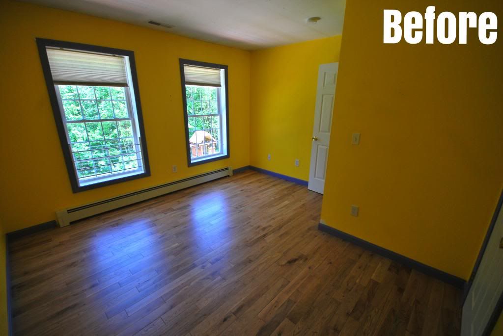
Neon yellow…purple trim…honestly who signs off on this? Lesson learned: my kids will never get the choose the colors for their rooms. Maybe they can choose from the color family, but I have the executive power.
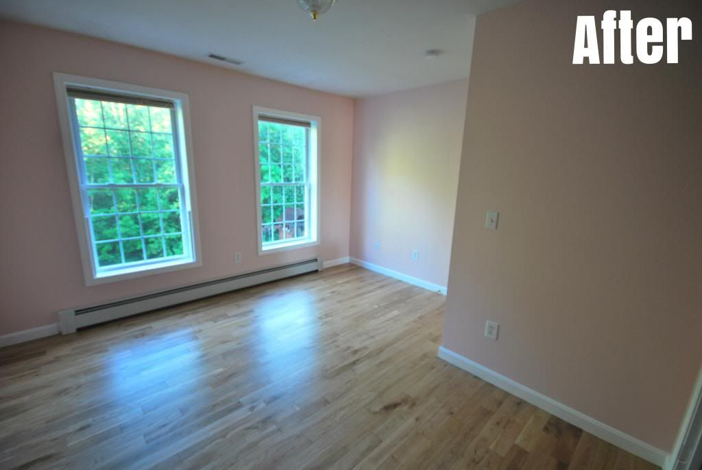

I went with a light (but rich) pink for the guest room (and ultra pure white for the trim). This is the first room I had ever painted trim on and, to be honest, I hope it's the last. Painting trim is a headache, and trying to paint purple trim white is even more of a headache. But the colors are a lot softer. All I need is some white furniture and this room will be perfect.
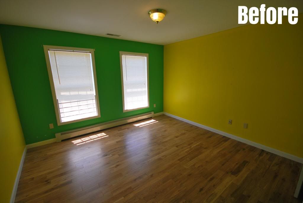
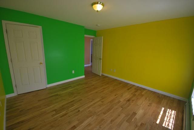
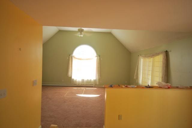
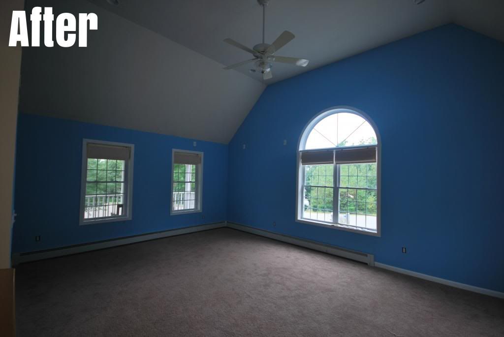
I honestly hope they were getting royalties from Sprite, because this is nothing short of a soda advertisement. The worst is that, as we learned from inspecting every corner while painting, this room was once a rich blue color. And the previous room was a nice beige. Why try to fix what isn't broken, honestly.
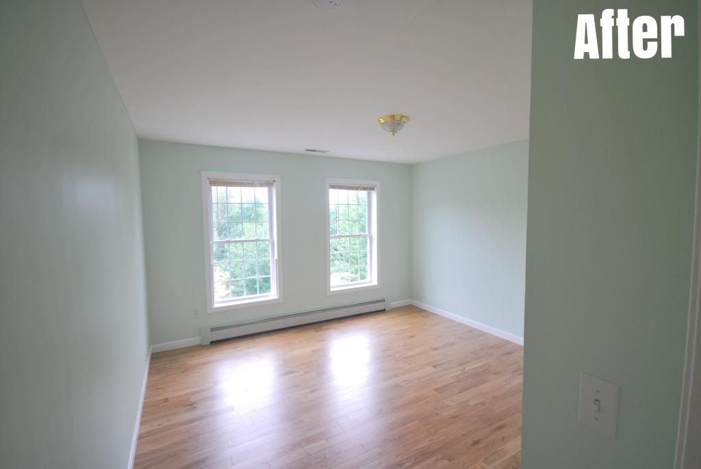
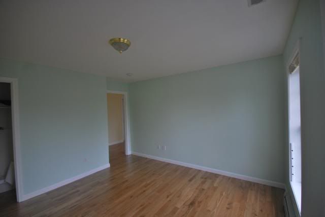
While light green does not work in a den, it works wonderfully in a bedroom. My childhood bedroom was actually a light green just like this one. It's just so much easier on the eyes.
Slowly but surely, this house is truly becoming our own. From picking out the right colors to organizing our stuff into its rightful places, this house is becoming a home faster than I could've imagined.
Hi! What color/brand paint did you use for the pink guest bedroom?? Thanks! - Meghann S.
ReplyDeleteHey there -- we used Sherwin Williams paint, "6602 - Angelic" pink. Hope that helps!
DeleteHi, what color and brand of cream did you use? Thanks!
ReplyDeleteHey there,
DeleteI used Sherwin Williams: "Creme Brulee" for the Foyer and "Pot of Cream" for the kitchen (those are the names of the Behr versions, but Williams was able to color-match pretty easily).
- Abby